by Juli Coleman, Chief of Improvement, School Networks, and Amanda Meyer, Senior Director of Improvement, CORE Districts
May 29, 2025
A golden rule of improvement work is “you can do anything, but you can’t do everything.” That is certainly true when it comes to displaying improvement data. Putting the right data, at the right time, in the hands of those who need it, is key to improving student outcomes. The CORE Districts’ on track improvement network connects educators in 38 schools across 8 California districts. Since it launched in 2019, our data displays about grades and attendance have been meticulously fine-tuned to support implementation of student success systems. We regularly hear first-hand accounts about how our data is helping participants understand where to focus and determine if improvement is happening.
One strength of CORE’s network is that we work with teacher teams, cross-functional on-track teams, principals, principal supervisors and superintendents, so we have opportunities to hear multiple perspectives and learn alongside all of these audiences. When determining the best visuals to show variability, we consider the following six variables:
- Measures – What do we want to know?
- Audiences – Who needs to learn from the data?
- Purposes – How will the data be used?
- Types of Variation – Shall we consider data over time or across units?
- Appropriate Displays – Are our chosen displays best for the measure, audience and purpose?
- Actions – How might our displays inspire and inform action?
Below, we highlight our top 3 recommendations for displaying data to empower action at various levels of the education system.
Reveal variation
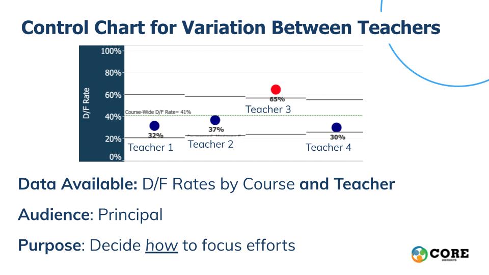
Aggregated data doesn’t fuel improvement work, and attending to variation is an essential aspect of improvement science. Revealing variation between students, courses, departments and schools provides a much clearer understanding of how the system is performing and where support could be provided.
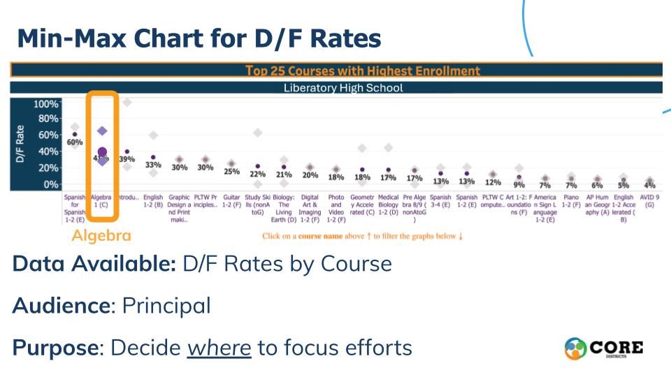
Identify leverage points in the system using the Pareto Principle
The Pareto Principle states that for many outcomes, roughly 80 percent of consequences come from 20 percent of causes. In our improvement work we believe teams should focus their actions where they can have the greatest impact. For example, 20 percent of the students in a high school class might be responsible for 80 percent of late or missed assignments, often due to personal challenges, illness or other issues. Make-up days, especially when students understand the material, can give these students enough time to make up assignments, and greatly impact their final grades. To help educators identify leverage points, our network uses grade and attendance data displays that reveal where off-trackness is coming from in order to expose entry points. That way educators can have the greatest impact on students’ on track outcomes.
Make the data actionable for the audience
We have learned a lot about the most useful and actionable data for stakeholders at different levels of the system. A key principle of our work has been to ensure educators look at data related to things they are best positioned to impact, displayed in ways that make action easy.
CORE’s network serves schools where on average more than half of the students start 9th grade off track for graduation and postsecondary success. Since the launch, thousands of students have shifted their trajectory from off track to on track by the end of their freshman year. The on-track rate has increased by double digits. The percent of Ds and Fs has decreased by 12 percent. The impact for African American and Latinx students is even more significant in many schools. Our work is evidence that when educators have compelling, actionable data and dedicated time to work together on solutions, their ideas move beyond one site and throughout the CORE network.